Cleveland Botanical Garden Brand Redesign
Breathing new life into a historic brand.
Made for educational purposes, this conceptual redesign of the Cleveland Botanical Garden Brand is aimed at creating a more approachable brand for the public.
This redesign was broken into a few different pieces. The main focus was on the logo, but supplemental materials were created to help express the brand. This includes a motion piece, a stationary set, a signage system, and totes bags meant for patrons at the gardens.
Logos


The first step of the project was to design the logo. The only Cleveland Botanical Garden logo felt very old-fashioned so this logo strives to create a modern feeling without losing the style the first logo had. This was done by shortening the name of the gardens, changing the typeface, and
Motion Piece
This is a motion piece created for the brand. It is meant for use for marketing purposes, such as a social media post or an online advertisement.
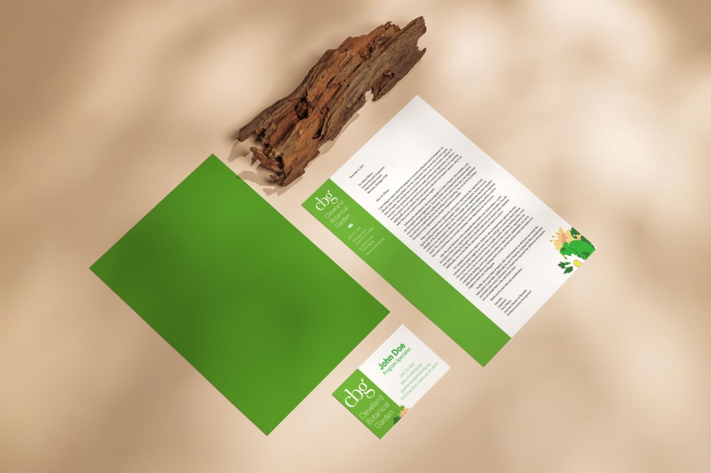
Stationary
This stationery set was created with the new brand in mind. It’s meant to be used for internal purposes at the company, such as employee memos or communication.


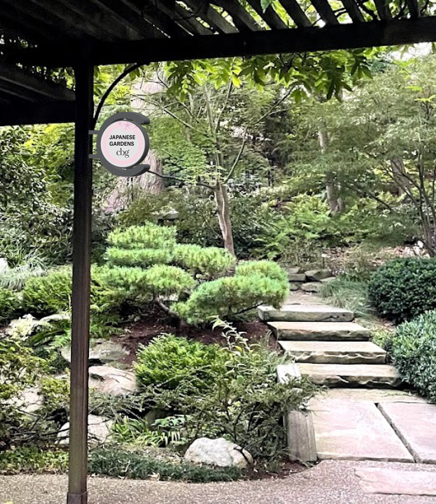
Signage System
This is a hypothetical signage system created to reflect the new brand. Each sign has illustrations that represent the area the sign points to.


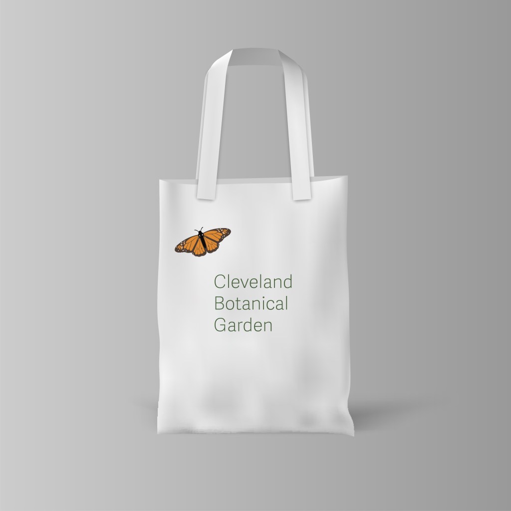
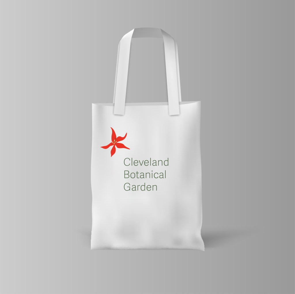
Tote Bags
These are tote bags that are meant to have handouts for patrons. The designs are meant to reflect different aspects of the Cleveland Botanical Gardens.